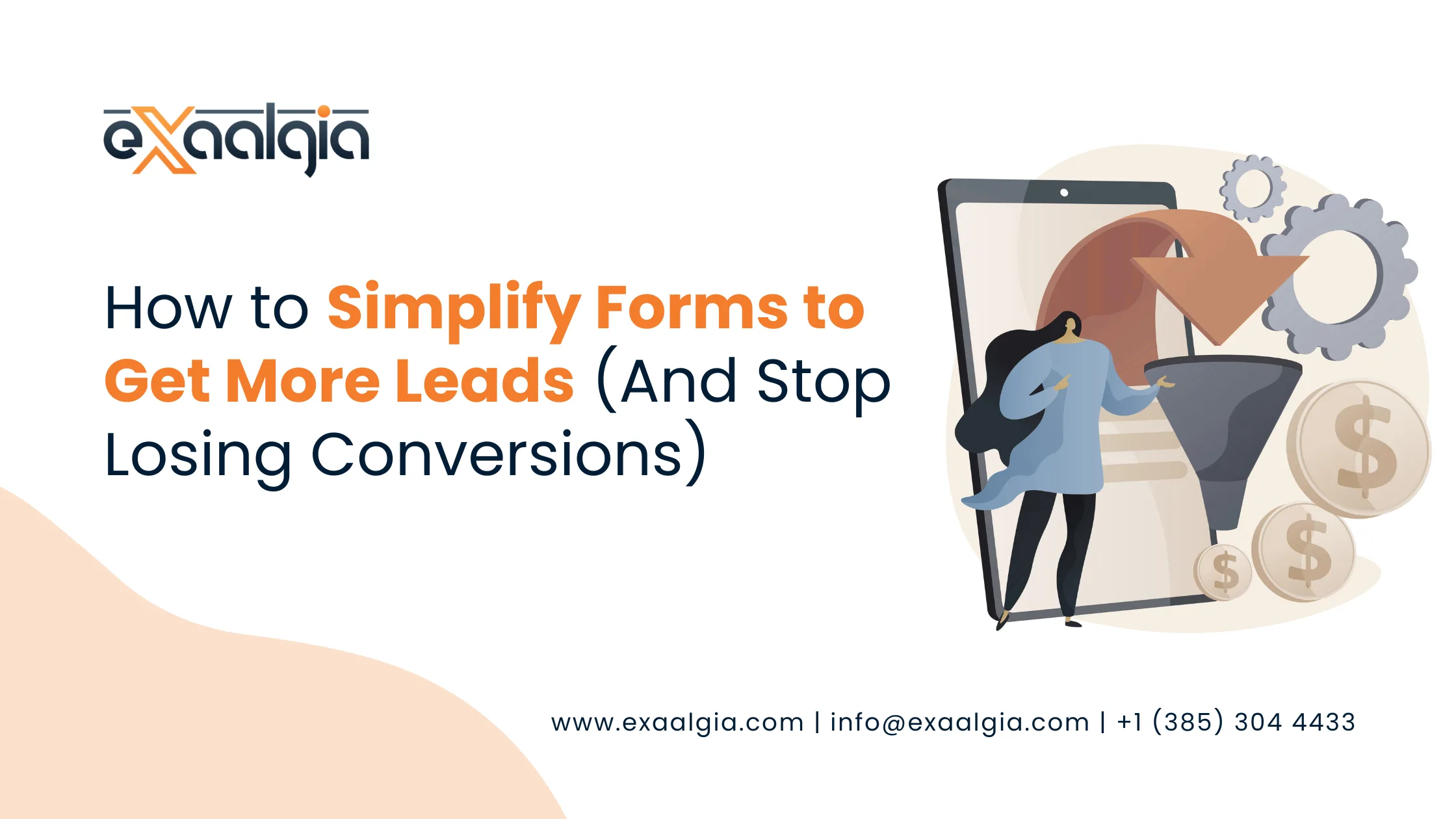
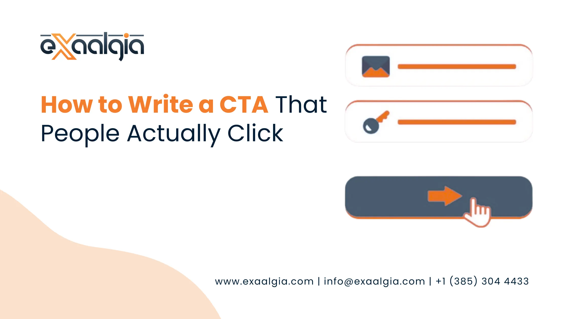
A call to action (CTA) is the bridge between a visitor and a customer. Get it wrong, and all your marketing effort evaporates. Get it right, and even a mediocre page can generate serious results. In this guide, you will learn exactly how to write a CTA that compels real people to take real action.
If you are working with a professional content writing service, understanding what makes a CTA work will also help you brief your writers better and get a copy that actually converts.
What Is a CTA and Why Does It Matter?
People receive a call to action which indicates their required next step. These elements which can be used for this purpose include a button which displays “Get Started Free”, a hyperlink which shows “Download the Guide”, and a sentence which states “Book your free strategy call today”. But the real question is – is your call to action strong enough?
CTAs exist in multiple locations which include websites and email campaigns and blog posts and social ads and landing pages.
The following explanation shows why they matter so much:
A well written CTA can increase conversions by 120% or more compared to a generic one. The pages which contain a single focused CTA achieve better performance results than the pages which have multiple competing CTAs.
Button color, placement, and copy together determine whether a visitor clicks or bounces.
“A call-to-action is not a formality. It’s the most strategic sentence on your page. Every word in it either earns its place or costs you a conversion.” — CTA Copywriting Principle, Digital Marketing
The goal of every CTA is simple: Reduce friction and make the next step feel obvious, low-risk, and immediately valuable. But most businesses write CTAs that do the opposite. Let’s fix that.
The 6 Elements of a High-Converting CTA
Before we get into formulas and examples, let’s understand the building blocks. Every effective CTA contains most (if not all) of these six elements:
| CTA Element | What It Does | Example |
| Action Verb | Drives momentum; tells user exactly what to do | Get, Download, Start, Join, Claim |
| Value Proposition | Answers “what’s in it for me?” instantly | “your free report,” “your custom plan” |
| Urgency or Scarcity | Creates a reason to act now, not later | “Today only,” “Limited spots,” “Expires soon” |
| Risk Reversal | Removes fear of commitment | “No credit card required,” “Cancel anytime” |
| Specificity | Builds trust and sets clear expectations | “Get your 30-day free trial” vs. “Sign Up” |
| First-Person Voice | Increases personal ownership and click rates | “Start my free trial” vs. “Start your free trial” |
Research consistently shows that switching CTA copy from second person (“your”) to first person (“my”) can lift click-through rates by nearly 90%.The use of that one particular word creates two distinct outcomes which determine whether a visitor perceives themselves as being sold to or making their own decision.
5 Proven CTA Writing Formulas
You should not create an entirely new solution because existing methods already complete your task. The formulas have been tested successfully across more than 1000 landing pages and email campaigns and advertisement tests. This formulas should be combined and customized to match your brand’s unique voice.
Formula 1: The “Get + Value” Formula
Simple and direct. Lead with “Get” followed by the specific benefit.
- “Get My Free SEO Audit”
- “Get Instant Access”
- “Get the Step-by-Step Guide”
Formula 2: The “Start + Outcome” Formula
Perfect for SaaS, services, and courses. Emphasizes transformation.
- “Start Growing My Traffic Today”
- “Start My Free 14-Day Trial”
- “Start Building Better Content”
Formula 3: The “Yes, I Want + Desire” Formula
Highly personal and psychologically powerful. Used on sales pages.
- “Yes, I Want More Leads!”
- “Yes, Send Me the Free Template”
- “Yes, I’m Ready to Scale”
Formula 4: The “Urgency + Action” Formula
Works best with a deadline or limited availability. Use sparingly to stay credible.
- “Claim Your Spot – Only 5 Left”
- “Book Now – Offer Ends Friday”
- “Download Before It’s Gone”
Formula 5: The “Question + Answer” Formula
Opens a loop in the reader’s mind, then closes it with the CTA.
- “Ready to rank higher on Google? Let’s talk.”
- “Want more clicks? Get the free guide.”
Pro Tip: You should use your CTA formula together with a micro-commitment question which you should place directly above the button. Example: “Tired of content that doesn’t convert?” followed by “Get My Free Content Strategy Call.” This primes the reader psychologically before they hit the button.
Weak CTAs vs. Strong CTAs: A Side-by-Side Comparison
Let’s see the difference in practice. The table below shows common weak CTAs and their stronger, conversion-optimized alternatives:
| Weak CTA | Strong CTA | Why It Works Better |
| Submit | Get My Free Report Now | Adds value + ownership + urgency |
| Click Here | Yes, Show Me How It Works | First-person voice + curiosity trigger |
| Learn More | Explore Our Content Writing Services | Specific, describes the destination |
| Sign Up | Start My Free 30-Day Trial | Specificity removes ambiguity + fear |
| Buy Now | Claim Your Discount, Today Only | Reframes cost as a gain; urgency |
| Contact Us | Book a Free 15-Minute Strategy Call | Low commitment, clear value exchange |
CTA Placement: Where You Put It Matters as Much as What It Says
Even the best written CTA will fail if its placement does not draw any attention from viewers. Here is the common placement area for effective CTAs which succeed in their performance.
Above the fold: Visitors see this without scrolling. Best for high intent pages like landing pages and service pages.
After the value hook: Place a CTA right after you’ve made a compelling case. Don’t make readers search for “next steps.”
Mid article: In long form blog content (like this post), a mid-page CTA catches readers who are already engaged but won’t scroll to the bottom.
End of content: The natural conclusion spot. After reading, users want to know what to do next, give them an answer.
Sticky header/footer: Keeps the CTA visible during scrolling without being intrusive.
The most effective location for blog content to achieve maximum conversions exists after the second or third section of the post, which enables bloggers to demonstrate their expertise while providing readers authentic value. This statement applies particularly to search engine optimization content because it attracts visitors who have strong intent to convert but require gradual guidance before making purchases.
Design and CTA Copy: They Work Together
Writing an effective CTA text gets you halfway there. The graphic part seals the deal. Here are design principles that amplify your copy:
Button color contrast: Your CTA button must stand out. If your site is blue, use an orange or green button. The goal is immediate visual contrast, not “pretty.”
White space: Surround your CTA with breathing room. A cluttered CTA gets ignored.
Button size: Big enough to tap on mobile. Small enough not to look desperate. Test both on mobile and desktop.
Supporting micro copy: Add a one liner below the button – “No spam. No credit card. Unsubscribe anytime.” This micro copy removes the last objection before the click.
Directional cues: An arrow pointing to the button, or a photo of a person looking toward the CTA, subtly directs attention.
“A CTA isn’t just a button. It’s the final handshake between your brand and your visitor. Make it feel like an invitation, not a demand.” — Conversion Copywriting
How to A/B Test Your CTAs for Maximum Performance
Expert copywriters reach their conclusions through testing instead of making guesses about what will succeed. A/B testing (split testing) lets you compare two versions of a CTA to see which drives more clicks and conversions.
Here’s a simple CTA A/B testing framework:
| Step | What to Do | What to Test First |
| 1. Identify | Pick one CTA to test, usually the primary conversion CTA | The button copy (text) |
| 2. Hypothesize | Form a clear hypothesis: “Changing X to Y will increase clicks because Z” | First person vs. second-person voice |
| 3. Run | Split traffic 50/50 between version A and version B | Button color or placement |
| 4. Analyze | Run the test for statistical significance (min. 100 conversions per variant) | Adding or removing urgency phrases |
Most businesses test button color first, but studies show that CTA copy has a 3x greater impact on conversions than button color. Start with the words, then optimize the visuals.
This is exactly where a strong digital marketing strategy makes the difference, combining data driven testing with expert copywriting to compound your results over time.
CTA Mistakes to Avoid
Knowing what not to do is just as valuable as knowing what to do. Here are the most common CTA mistakes that silently kill conversions:
Too many CTAs on one page: Choice paralysis is real. Lead with one primary CTA and keep secondary ones subtle.
Vague language: “Click here” tells the reader nothing about what they’ll get. Be specific.
No urgency: Without a reason to act now, most visitors will “come back later”, and never do.
Mismatched CTA and landing page: If your CTA says “Get a Free Audit” but the landing page asks for payment details, trust is instantly broken.
Ignoring mobile UX: Over 60% of web traffic is mobile. A tiny CTA button that’s hard to tap costs you every mobile visitor who would have clicked.
Skipping the test: Writing one CTA and never testing it is like guessing. The two options “Download” and “Get My Copy” show that even minor changes can produce completely different outcomes.
Real CTA Examples by Content Type
Below are CTA examples that have been proven to produce a high conversion rate for different types of content.
| Content Type | Effective CTA Example |
| Blog post | “Loved this? Get our free content strategy checklist.” |
| Service page | “See how our content writing team can grow your traffic, Book a Free Call.” |
| Email campaign | “Your competitors are ranking for this keyword. Claim your free SEO audit today.” |
| Social media ad | “Stop guessing what to post. Get your 30-day content calendar free.” |
| Exit-intent popup | “Wait, before you go! Download our CTA swipe file. No email required.” |
| Product page | “Add to Cart, Ships free in 24 hours, no minimum order.” |
Your CTA Is a Promise, Not a Command
Best CTAs don’t demand action, they make action feel like the most natural, logical, and desirable next step in the world. The text directly addresses the reader’s needs while it eliminates all possibilities of delay and it presents the value of the text in five words or less.
Whatever contents you are optimizing, whether a blog post, a service page or an email newsletter, the fundamental rule is the same: be specific, be personal, be direct, and always be testing.
If you want content that will drive conversions from its initial word to its closing call-to-action, please see our professional content writing services or observe how our SEO strategies transform excellent content into tangible business growth.
Ready to Write CTAs That Actually Convert?
Let our content and SEO experts craft high-converting copy tailored to your audience and goals.