

We are here to share practical tips to get your site mobile-ready, so you can keep customers happy and boost your sales. Whether you’re tweaking things yourself or teaming up with an e-commerce website developer, these ideas will make your store a mobile shopper’s dream.
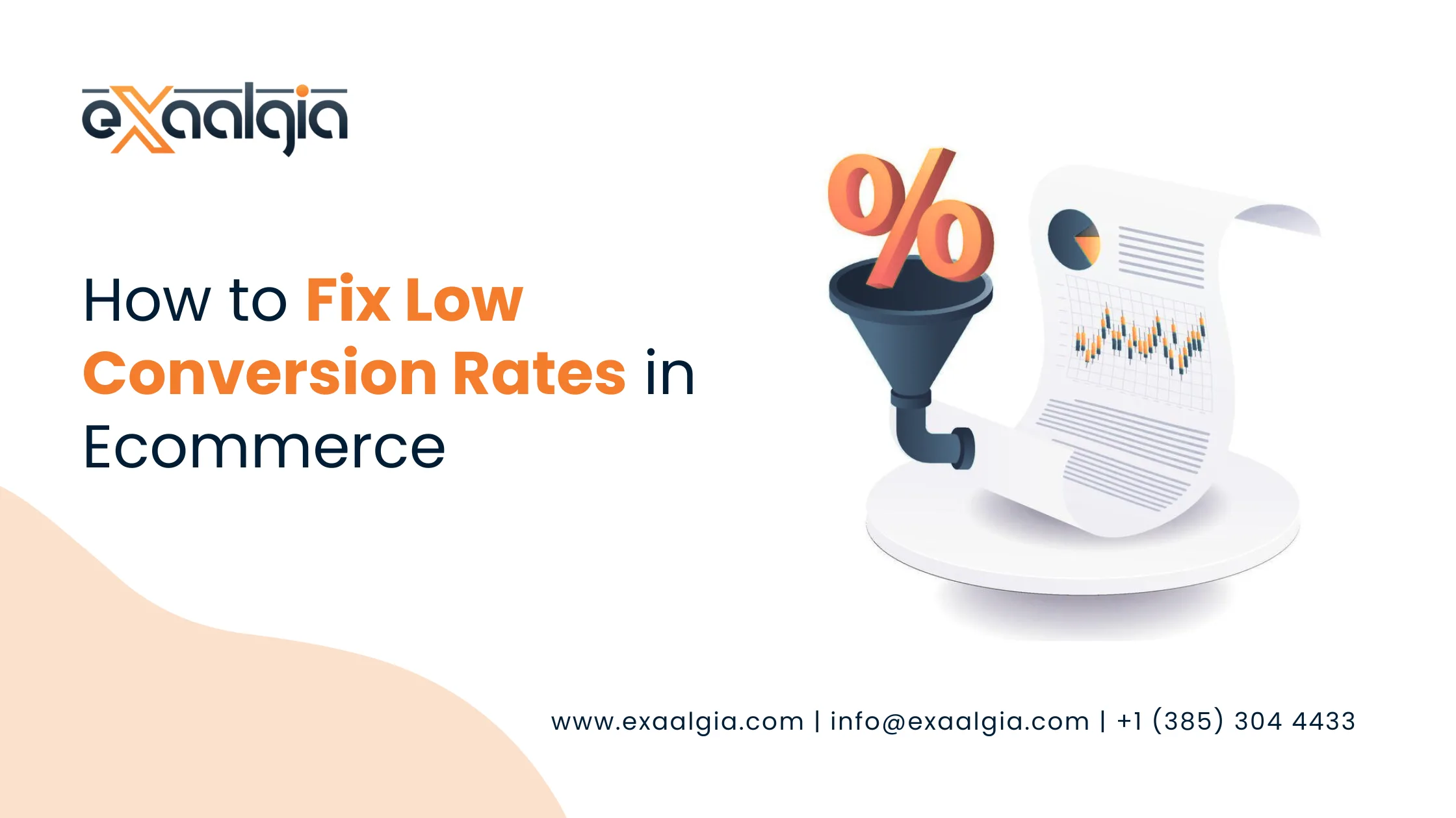
Why Mobile Optimization Is a Big Deal
Let’s be real—most people shop on their phones these days. Over half of online purchases happen on mobile devices, and that number’s only growing. If your site isn’t smooth and easy to use on a phone, you’re pushing customers away. A mobile friendly ecommerce site isn’t just nice to have; it’s a game-changer. Working with ecommerce website development experts can help you nail this. Here’s why it matters.
Keeps Shoppers Smiling
A fast, easy-to-use mobile site makes customers happy. Clear images, simple navigation, and quick load times keep them browsing instead of bouncing.
Helps You Rank Higher on Google
Google loves mobile-friendly sites and rewards them with better search rankings. That’s a big win for your SEO for Your eCommerce business, bringing more visitors to your store.
Turns Browsers into Buyers
When your site’s easy to navigate on a phone, people are more likely to hit that “buy” button. A mobile-optimized store boosts your sales.
Meets Today’s Standards
Shoppers expect your site to work perfectly on their phones. If it doesn’t, they’ll head to a competitor who’s got it figured out.
Plays Nice with Social Media
Ever notice how much traffic comes from Facebook, Instagram, LinkedIn, or other platforms? A mobile-friendly site ensures those visitors stick around and shop.
Stops People from Leaving
A slow or clunky mobile site sends customers running. Optimization keeps them exploring your products instead of hitting the back button.
Create a Design That Works on Any Screen
A responsive design is like a chameleon—it adapts to any device, from a tiny phone to a big tablet. This is key to making your ecommerce site mobile-friendly. Teaming up with an ecommerce website development company in the USA, like Exaalgia, ensures your site looks great and works flawlessly everywhere. Here’s how to do it right.
Use Flexible Layouts
Think of your site like a stretchy yoga mat—it should adjust to fit any screen size. Flexible grids make sure images, text, and buttons scale perfectly.
Shrink Images Without Losing Quality
Big images can slow your site to a crawl. Compress them to load faster while still looking sharp. Tools like Semrush can spot image issues duringn e-commerce site audit.
Make Buttons Easy to Tap
Ever tried clicking a tiny link on a phone? It’s the worst. Design big, touch-friendly buttons to keep shoppers happy.
Keep Navigation Super Simple
A messy menu confuses people. Use a clean, collapsible “hamburger” menu to save space and make browsing a breeze.
Test on All Kinds of Devices
Not every phone shows your site the same way. Test it on different devices to catch any quirks. An ecommerce website developer can take this off your plate.
Choose Fonts That Pop
Tiny or fancy fonts are a pain to read on phones. Pick clear, readable fonts with enough space to make text easy on the eyes.
Speed Up Your Site for Impatient Shoppers
Mobile users want speed—waiting around isn’t their thing. A slow site frustrates customers and kills your sales. Partnering with a Digital Marketing Agency in USA can help you fine-tune your site’s performance. Here’s how to make your store lightning-fast.
Cut Back on Heavy Elements
Too many scripts, images, or fonts can bog down your site. Trim these to keep things moving smoothly.
Let Browsers Save Time
Browser caching stores data so returning visitors get a faster experience. It’s a trick the best web development company in USA swears by.
Use a Content Delivery Network (CDN)
A CDN pulls content from servers close to the user, cutting load times like magic.
Tidy Up Your Code
Messy code—like extra CSS or JavaScript—slows things down. An ecommerce website development USA team can clean it up for you.
Keep an Eye on Speed
Check your site’s speed regularly with performance tools. Ecommerce website development experts know the best ones to use.
Compress Everything
Compressing images and files makes your site load faster without skimping on quality.
Make Checkout a Breeze
A tricky checkout process is like putting a roadblock in front of your customers. Mobile shoppers want to buy and go. An e-commerce website expert can simplify this for you. Here’s how to create a checkout that keeps people moving.
Let Them Skip the Sign-Up
Forcing users to create an account is a buzzkill. Offer a guest checkout option to speed things up.
Auto-Fill the Boring Stuff
Auto-fill for addresses and payment info saves time and makes mobile checkout a snap.
Offer Lots of Payment Options
Add mobile-friendly options like Apple Pay or PayPal to give shoppers choices they love.
Keep Forms Short
Long forms are a turnoff. Ask only for what you need to get the sale done.
Show Where They Are
A progress bar lets shoppers know how close they are to finishing, so they don’t give up.
Build Trust with Security
Show off trust signals like SSL certificates to reassure mobile users their info is safe.
Nail Mobile SEO to Get Noticed
Mobile SEO helps your ecommerce site mobile-friendly show up higher in search results, bringing more shoppers your way. A digital marketing agency USA can help you get this right. Here’s what to focus on.
Pick Keywords for Mobile Users
Use terms like ecommerce site mobile-friendly that match what people search for on their phones.
Write Short Meta Tags
Craft meta titles and descriptions that look clean on mobile screens without getting chopped off.
Make Text Easy to Read
Use big, clear fonts and enough spacing so shoppers can read without squinting.
Ditch Annoying Pop-Ups
Pop-ups that block content drive mobile users nuts and hurt SEO. Keep them minimal or skip them entirely.
Tap into Local Search
For US businesses, local SEO helps nearby mobile shoppers find you faster.
Organize Your Site Clearly
A clean site structure makes it easier for search engines to crawl, boosting your rankings. This is where ecommerce website design USA pros shine.
Why You Can’t Skip Mobile Optimization
Let’s face it: a mobile friendly ecommerce site isn’t optional anymore. It’s how you keep customers happy, rank higher, and make more sales. Whether you’re giving your site a facelift or building from scratch, working with the best web development company USA like Exaalgia can save you headaches. Their expertise in ecommerce website development USA ensures your store is fast, user-friendly, and ready for mobile shoppers.
Why is eCommerce Website Development Important?
A top-notch ecommerce site drives sales, improves SEO, and creates a great experience. Exaalgia specializes in building mobile-ready stores that deliver. Read here more.
FAQs
How can I tell if my site’s mobile-friendly?
Try Google’s Mobile-Friendly Test or run an eCommerce Site Audit with tools like Semrush to spot what needs fixing.
Why hire an ecommerce website developer?
An ecommerce website developer makes sure your site is fast, responsive, and built for mobile, saving you time and boosting results.
How does mobile SEO help my store?
Mobile SEO gets your site seen by more people on search engines. A digital marketing agency USA can tweak this for you.
Can Exaalgia make my site mobile-friendly?
You bet. Exaalgia, a top ecommerce website development company in USA, creates mobile-optimized sites tailored to your needs.
What’s so great about responsive design?
It makes your site look and work great on any device, improving both user experience and SEO, as ecommerce website design USA experts know well.
Wrap-Up
Turning your ecommerce site mobile-friendly is the key to winning over today’s on-the-go shoppers. With responsive designs, fast load times, and a checkout that’s a breeze, you’ll keep customers coming back. Don’t let a bad mobile experience cost you sales.
Team up with Exaalgia, a leader in ecommerce website development USA, to make your store a mobile masterpiece. Check out their ecommerce development services or explore their web design expertise to get started. Your shoppers deserve it, and your business will thank you.

